 Image 1 of 11

 Image 2 of 11

 Image 3 of 11

 Image 4 of 11

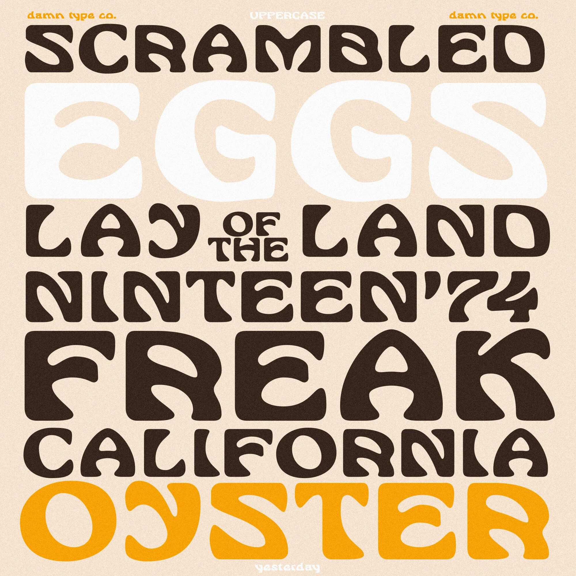 Image 5 of 11

 Image 6 of 11

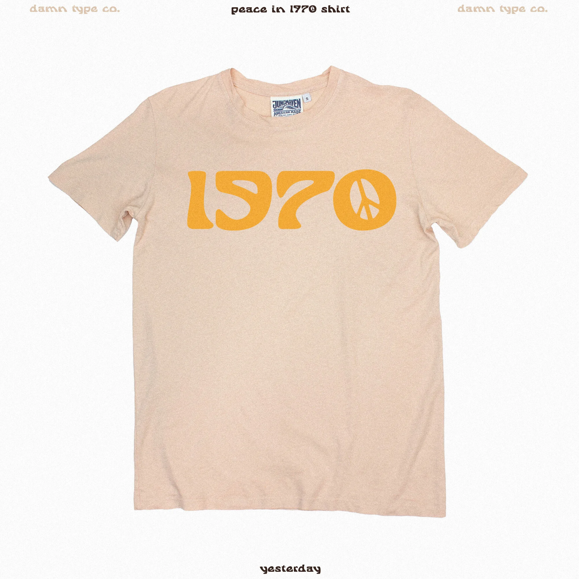 Image 7 of 11

 Image 8 of 11

 Image 9 of 11

 Image 10 of 11

 Image 11 of 11


Yesterday
The 3rd font from the Damn Foundry ~ Yesterday. Yesterday puts the FUN in funky and the SUPER in super rad. It’s a display font with art nouveau leanings and strong 70’s vibes. It was inspired by the hand lettered letters M-E-N & U I found on a, you guessed it, menu from the early 1900’s. One glance at the M and there was no turning back, sometimes it feels like the fonts make themselves once I get going. Yesterday WANTED to be made and quickly took on a life of it’s own.
I’m particularly fond of the unique flat bases of the lowercase and the font’s surprising versatility. This took a lot of fine-tuning to balance but I couldn’t be happier with the final product.
I hope you have fun with it, I can’t wait to see where Yesterday lives tomorrow!
*Good for personal and commercial use*
